In today’s fast-changing online world, having a solid online presence is extremely important for businesses and individuals. Modern website design elements are about more than just looking good; it focuses on creating a smooth user experience, being easily found on search engines, and working well on different devices.
In this blog post, VirtueNetz will discuss the up-to-date Modern website design elements in 2024, supported by the latest data and technical knowledge. Each year we get to see new styles in web design elements.
While it’s not a compulsion to make use of every new trend that comes your way, many of them have the potential to boost your visitors’ experience. With so many options to choose from, it gets really challenging for web designers to determine which styles and elements are worth considering.
Table of Contents
Website Design Elements – What Are They?
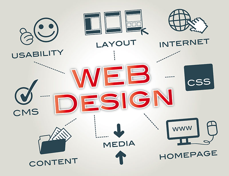
Website design elements are essential pieces that make a website look and work the way it does. These pieces include how it’s arranged, the colours used, the fonts, pictures, buttons, forms, and how you get around on the site. Putting all these pieces together is essential to get people interested in the area and ensure it meets its objectives.
What is Modern Web Design?
Modern website design is about more than just making basic, fixed websites. It’s about creating sites that are dynamic, interactive, and tailored to each user’s preferences. In 2024, modern web design emphasizes being fast, easy to use, and centered on the user, ensuring it works smoothly on any device.
Core Elements of Modern Website Design in 2024!
To narrow down their search, VirtueNetz has short-listed ten most important elements of web design that can be incorporated in a website to enhance its performance.
- Large Hero Images
- Card Design
- Large & Unique Font
- Background Videos
- SEO Optimized Elements
- Mobile-Optimized Design
- Designing with an ecological perspective
- Flat and Semi-Flat Design
- Responsiveness
- Consistent Typography
1: Large Hero Images
A large hero image is the latest in thing. Medium.com, a popular publishing site, is a prime example. The site has used a large hero image in above the fold area with little text and no call to action or social buttons. This accentuates the visual experience and encourages its users to scroll down and read more.
Large hero images can also be used in the backdrop with content on top, like the one on Uber’s website. Irrespective of the approach you may use, large hero images can visually convey your story to the visitors without relying on the text.
However, make sure that the images you use are responsive because your users have high expectations and they are accessing your site from their desktops, tablets and smartphones. By using responsive images, you will allow them to have the same experience no matter whichever device they may use.
2: Card Design
Pinterest was the first to utilize card design and since then web designing companies and marketers have become a fans of this layout. The card design is everywhere on the web because it transmits information in bit-sized chunks that are perfect for scanning.
The cards help you in keeping the homepage clean and organized because they break up different pieces of content and make it easy for users to pick and choose the articles they want to read.
For this very reason, the card design is swiftly becoming popular among B2C and B2B websites, as it’s relatively easy for users to digest the information in chunks.
But, just like the large hero images, you should use responsive card designs so their number and size can adapt accordingly as the screen size gets larger or smaller.
3: Large & Unique Font
Businesses are using a large and unique font to aid their customers in instantly recognize them as compared to their competitors. The New Yorker, for instance, is recognized through its use of unique typography, Adobe Caslon Pro. In fact, it’s not the only business that is using large font, startups and technology companies such as Zero are also leveraging the unique typography (Blokletters-Balpen) to segregate themselves from the competition.
The best thing about large typography is it uses one style trend across the site to lead users from one section to another. The New Yorker again serves as a good example.
However, you must ensure that your web designing company should consider your favorite font’s applicability across computers and browsers. Else, your website will appear awkwardly when it is accessed through different browsers and devices.
4: Background Videos
Your customers love stories and there is no better way to quench this thirst than to integrate a video that plays automatically in the backdrop. Not only it will add a lot to the site but also diminish the need to have huge chunks of content that elaborate your business.
Let’s consider Wistia’s example. As soon as you land on the homepage of this website, a large background video automatically starts playing. This background video is a great way to catch a visitor’s eye, who can later click through to view the main video.
Research has also shown that our brain processes videos 60,000 times faster than text. So there is no reason to evade background videos when redesigning or launching a new site.
5: SEO Optimized Elements
SEO is still crucial for web design. In 2024, there’s a big focus on making SEO-friendly web design elements to make websites appear better in search results. Websites with valuable and well-organized content have a better chance of ranking in search engines. Creating catchy titles and descriptions with relevant keywords is essential to improve click rates.
Structured data like Schema.org helps search engines better understand and show website details. Since Google mainly uses the mobile version of websites for ranking, optimizing sites for mobile devices is crucial to improve SEO.
6: Designing With an Ecological Perspective
In 2024, modern website design is taking a new approach, where websites are made to fit well with people’s online lives. They work smoothly with other platforms, apps, and social media. Moreover, this helps create brand loyalty and encourages more interaction with users. Remember, it’s essential to design your website elements to reflect your brand’s uniqueness or what makes you unique.
For example, using colors like red, yellow, blue, and green would be good if you have an online store. On the other hand, if you’re making a health and wellness site, using calming colors like sky blue, white, purple, and orange would be better. Make it easy for users to share content and allow them to log in using their social media accounts conveniently.
Also, connect your website to other apps using APIs to give users a complete experience. Using data about the users, you can offer them personalized content, recommendations, and services based on their preferences.
7: Flat & Semi-Flat Design
Flat design is a popular choice in modern web design because it is simple and minimal. Semi-flat design is a variation that adds a little depth and shadows to the flat elements, making it more visually appealing. Flat designs are used in logos, ads, and pictures, and they are so common that skeuomorphic designs are hardly noticed nowadays.
To achieve a clean and uncluttered look, use clean lines, bold colors, and lots of empty space. You can also follow Google’s Material Design guidelines, which blend flat design with subtle skeuomorphic elements.
8: Responsiveness
Ensure your website works well and looks good on many devices. Statistics reveal that in 2024, people want web pages to load quickly, preferably within two seconds. To achieve this, you can make image and video files smaller without losing their quality. You can also load only the parts of the page that are visible first and wait to load the other pieces until the user scrolls to them. It’s a good idea to regularly check how your website is performing and use tools like Google Page-Speed Insights to find areas where you can make it better.
9: Consistent Typography
Typography is vital for showing what the website wants to say and creating its brand. It’s essential to keep the same typography on different devices so that users have a consistent experience. Use fonts that go well together and are easy to read. Ensure the fonts look good on all screen sizes, so everyone can read them, even if they have trouble seeing them.
10: Mobile-Optimized Design
Because more people use the internet on their mobiles, it’s crucial to prioritize mobile devices in modern website design. More than 60% of online searches happen on mobiles. The website should adjust its layout and content to fit the user’s device screen. Compress images, simplify code, and use caching to make it faster on mobiles. It’s essential to have a user-friendly navigation system for easy browsing on small screens. So, responsive design and mobile optimization are a must.
Conclusion:
In 2024, website design elements are continuously improving, focusing on making websites user-friendly, mobile-friendly, and easy to find on search engines. Following the core elements mentioned in this blog post, web designers can create attractive, user-centered websites that work well in the fast-changing digital world.
So, if you have a website or plan to make one, consider these points and organize your website’s structure. Remember to cater to different users, whether they use a computer or mobile device, and optimize your website for search engines.
Once your design is ready, publish the website and enjoy the results! Staying updated with the latest trends and best practices will help designers succeed and positively impact website visitors.


 ?>
?>
 ?>
?>
 ?>
?>
 ?>
?>
 ?>
?>
